When Evening Paints the Heather

Tonight we explore Seasonal Dusk Color Palettes on the Heather Moors, tracing how spring’s airy violets, summer’s syrupy mauves, autumn’s bronze embers, and winter’s steel-lilac horizons gather at day’s edge. We translate lived walks, field notes, and science into practical, evocative palettes for artists, designers, photographers, and ramblers who crave quiet drama, grounding texture, and the calm certainty that twilight always returns to color the land again. Subscribe and share your own evening swatches; our next walk will compare coastal heath twilight with inland ridges.

Reading the Blue Hour Above the Heath

Blue hour on open moorland compresses distance, softening paths and letting heather’s residual warmth glow against a cooling sky. As the sun slips below the horizon, scattered shorter wavelengths pool into deep slate and harebell notes, while lingering reds enrich stems and seedheads. Notice lichen silvering stones, pooled bog water catching cobalt, and distant farm lights punctuating violet. Train your eye gently, breathing with the wind, until gradients resolve into confident, portable color families.

Seasons Turning Under a Purple Sky

Across the year, dusk modifies heathered slopes like a slow, generous editor. In spring, new growth rings the moor with tender mint and smoke-rose; by high summer, blooms push sugared mauves into honeyed air; autumn drops bronze, russet, and bitter plum; winter braids steel lilac with blue charcoal. Follow the calendar, and you’ll collect gentler transitions than midday offers, discovering families of hues that travel gracefully between projects, moods, and rooms.

From Bootprints to Swatches: A Maker’s Workflow

Gathering palettes begins with walking slowly enough to hear curlew and reed bunting punctuation. Record temperature, wind, and cloud height; they nudge color far more than a phone screen implies. Back home, translate observations into analog swatches, then confirm under warm and cool lamps. Iteration builds reliability, ensuring dusk stays honest.

Light, Air, and Heather: The Science Behind the Glow

Twilight color owes much to scattering and surfaces. At low solar angles, longer wavelengths survive the path, embers rising while blues deepen into calm pools. Heather’s tiny tubular flowers and matte leaves diffuse highlights, peat absorbs glare, and thin mist behaves like a gigantic soft-box. Understanding these interactions steadies choices.

01

Why Purple Deepens After Sunset

Rayleigh scattering trims shorter wavelengths from direct light, so indirect skylight leans blue while low-angle sun enriches reds. On the moor, those reds kiss magenta pigments, darkening perceived purple. Stand north-facing during civil twilight and watch mauve accumulate like tide, tide that recedes only when true night settles.

02

Moisture, Haze, and Honest Softness

Humidity thickens air, softening edges and preventing garish contrast. Tiny droplets scatter light forward, flattering faces, stones, and stems. Designers can emulate this by desaturating high-contrast pairs and expanding midtones. In photography, expose for highlight integrity, then lift shadows gently; you’ll preserve that truthful softness we breathe on the moor.

03

Ground Bounce: Peat, Gritstone, and Lichen

Underfoot surfaces bias palettes. Peat drinks light, lowering overall value; gritstone can reflect muted warmth; lichen contributes powdery silver. When planning brand palettes, test swatches near dark flooring and pale desktops to simulate that ground bounce. Colors that still cohere have proven themselves under authentic, moor-inspired optical conditions.

Stories From the Edge of Day

The Evening the Map Went Quiet

A hiker’s GPS died, and with it the compulsion to rush. Standing still, she noticed frost beginning on sedge, turning green toward glassy blue. That observation birthed a palette for hospital wayfinding, one that calms stressed eyes without hiding essential cues. The device failed; noticing did not.

When Smoke Drifted, Mauve Grew Brave

A legal stubble burn miles away sent a faint veil over the valley. Sunset reddened through it, deepening heather’s mauve to something almost wine-dark. A photographer underexposed by two thirds, later raising shadows to keep that bravery intact. The resulting series funds conservation signage today, closing a thoughtful circle.

A Child Named the Color ‘Promise’

In August, a family watched dusk bloom from a stone wall. The youngest pointed at the horizon and said, Promise. The parents wrote it down. Years later, that word guided a charity’s palette, pairing hopeful mauve with steady slate and welcoming cream. One breath, preserved, continues helping strangers navigate tenderness.

Interiors: Hearth Calm Without Dimming Joy

Start with a generous mid-tone like honeyed mauve on walls, layer slate-lilac textiles for evening depth, then quicken corners with lichen-silver metals. Add warm lampshades to emulate afterglow. Test against daylight and LEDs. Spaces that respect dusk nuance can remain restful while still feeling alive to conversation and laughter.

Branding: Quiet Confidence, Clear Legibility

Pair a deep, trustworthy ground—peat umber or blue-charcoal—with readable text in cream or lichen silver. Use heather mauve sparingly for calls-to-action, avoiding candy saturation. Check contrast ratios and color-blind simulations. Invite customers to submit their dusk photos; featuring them builds belonging while keeping the palette rooted in shared experience.

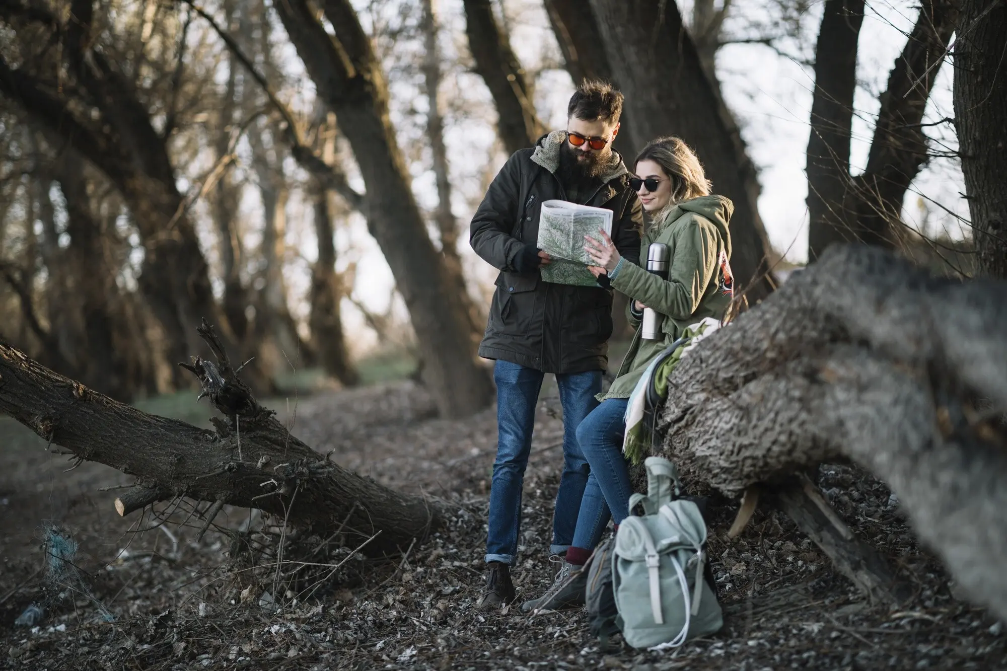
Wardrobe and Gear: Walkable Evening Hues

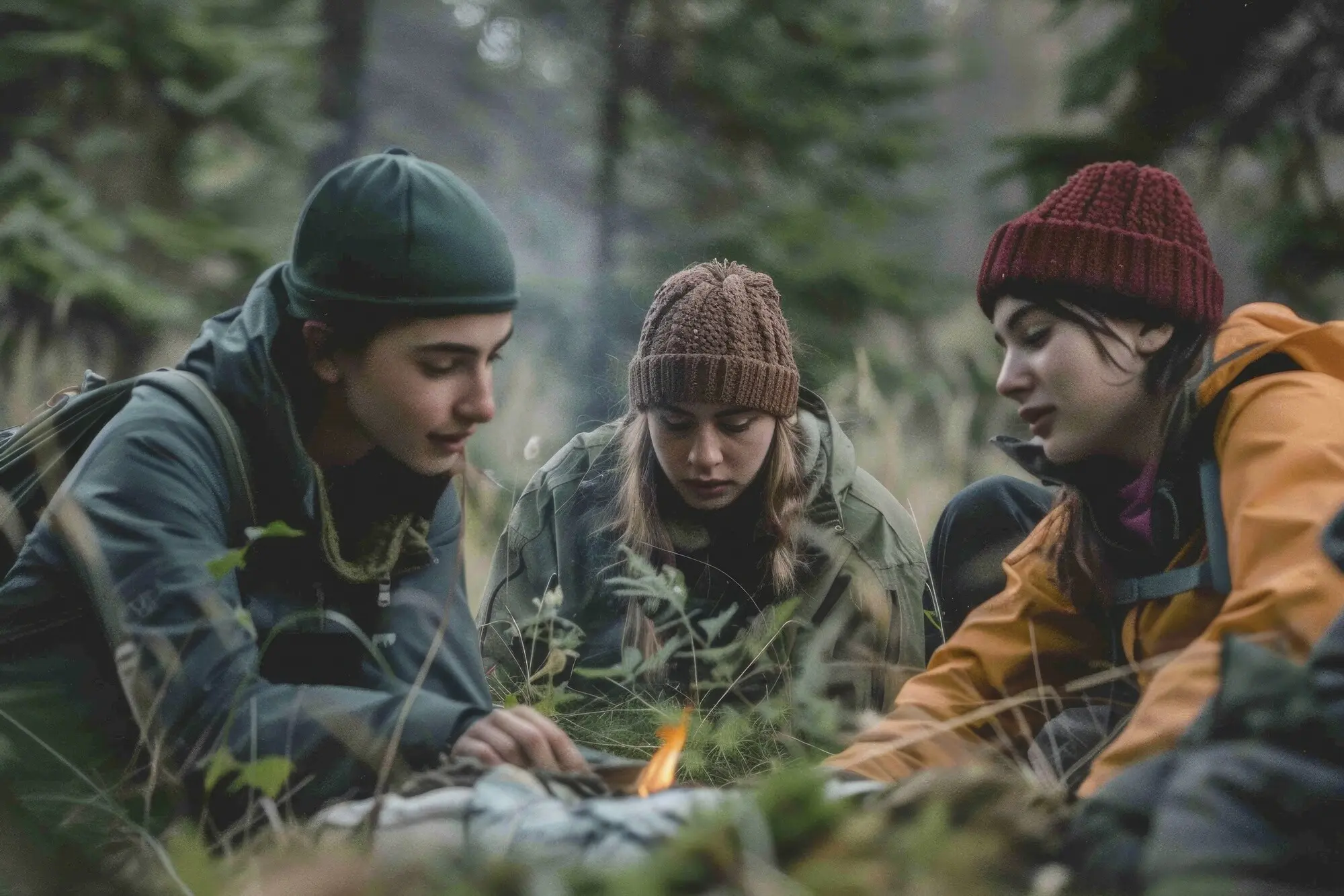
Clothing benefits from moor-tested combinations: jackets in storm-lilac, base layers in heathery taupe, accents in bellflower blue. Reflective trims can echo lichen silver, improving safety without shouting. Builders of small-batch gear, share prototypes with our readers; field testers in windy places love reporting how color performs in rain.

Zunokentomoripalo
Privacy Overview

This website uses cookies so that we can provide you with the best user experience possible. Cookie information is stored in your browser and performs functions such as recognising you when you return to our website and helping our team to understand which sections of the website you find most interesting and useful.